Your website is an important part of a B2B buyer’s decision making process. It helps you attract, engage, delight, and convert the right visitors – so it’s important to get it right. You need a website that’s powerful, eye-catching, and well designed.
The expectations of B2B websites are rapidly changing. Today’s users are exposed to so many forms of marketing communications in day-to-day life, they expect a similar experience to B2C brands. This includes things like clear user journeys and consistent branding across a website.
We’ve put together our top B2B website designs of 2023. These websites showcase the latest website design and branding innovations that we think will help B2Bs stand out this year and beyond.
1. Forethought
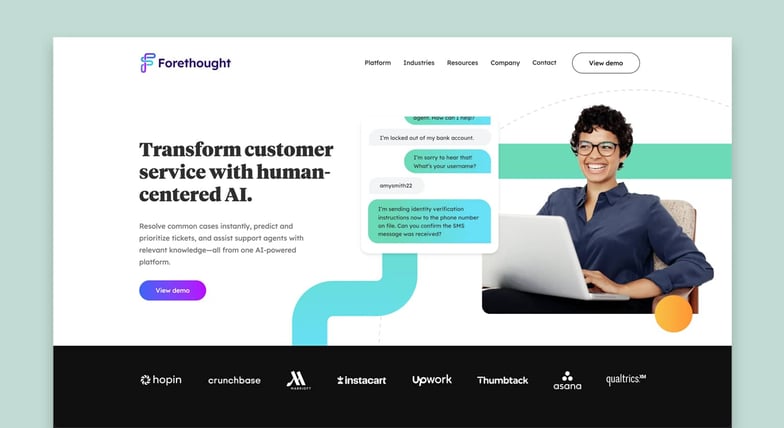
The Forethought website is engaging for a number of reasons. From its use of distinct brand colours for each product to its animations, Forethought embodies the current trends of B2B website design.
The website layout provides a clear user journey. Ample whitespace reduces clutter, and line imagery that flows down the middle of the page directs user attention.
Animated imagery is used to display the Forethought platform’s user interface (UI), and this helps the user visualise what it’s like to use the product. Then micro animations, that move as the user scrolls, make the design appear more premium.
These design elements are uniform from page to page. This creates consistency for the user and strengthens Forethought’s brand identity.
2. Aerotime
Ultimately, B2B buyers are people too. And many are just looking for a useful solution that will solve a problem.
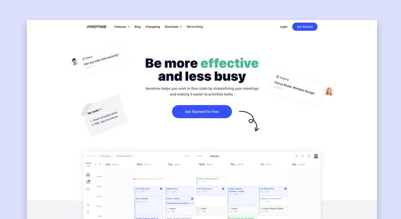
The Aerotime website addresses this with a bold, typography-led hero that makes its benefits instantly clear. Then parallax animations, which move the website layers as the user scrolls down the page, make the user journey engaging. And the use of hand-drawn arrows, post-it notes, emojis, and illustrations provides a personable feel. This helps Aerotime establish its brand identity.
But the user doesn’t get lost in its branding. The structure of the website is easy to understand, while bold headings and links enable a strong visual hierarchy. It’s clear where each section begins and ends, and it’s clear where users can click.
3. Aston Currency Management
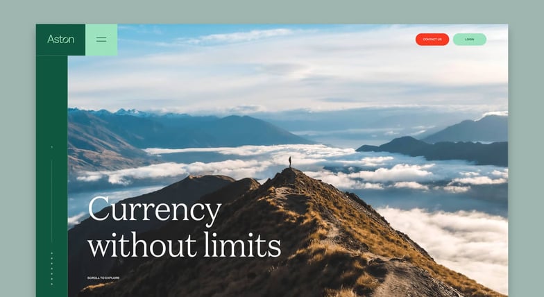
Great B2B website design can help differentiate you from other businesses in your industry. And the Aston Currency Management website does exactly that.
Recognisable brand colours, such as green, that contrast with strong imagery are the first things that greet users of the website. The use of people in imagery creates a personable feel, which is beneficial for this service-led business.
Green is seen as confident and positive colour in popular psychology. This makes it a great choice for B2Bs looking to inspire trust within their audience.
Elena Hemming, Digital Designer, Blend
Additionally, Serif typography prompts feelings of a ‘old-school’ and professional business. While the Sans Serif body copy provides an elegant touch.
Lastly, the ‘storybook’ design of the Aston Currency Management website gives the user a chronological narrative to follow. And a progress bar intuitively moves along the journey with them.
4. EverydayRobots
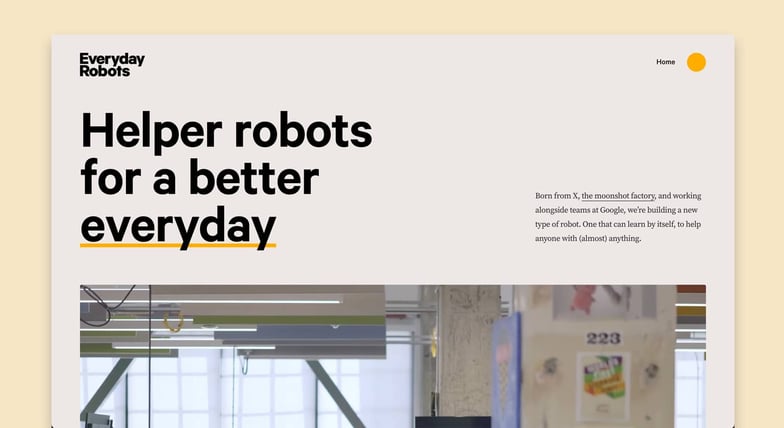
Big, bold typography paired with clear imagery is the standout design choice of Everday Robots. This complements the company’s branding as a thought-leader of innovative, “big” ideas.
As the user scrolls down the page, animation hijacks the user’s scroll. This directs the user’s journey to encourage them to absorb and read information, such as an animated graph, before moving further down the page.
As the page continues, features like video transitions grow larger on the screen when the user reaches them. This is a great method in B2B website design to draw attention to certain elements of their offering. This is especially useful for B2Bs who want to be product-led.
The EverdayRobots website is a fantastic example of a B2B website that looks impressive on mobile devices too. The user journey remains clear and consistent no matter what devices it’s viewed on, which is an important consideration for any modern business.
5. Overpass
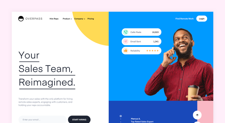
The Overpass website has remained in our rankings for top B2B website designs for the last few years. Its sleek and fun imagery is immediately eye-catching. And the use of heavy colour blocking helps solidify the company’s striking brand.
However, Overpass also uses whitespace to draw the user’s attention to important copy or imagery, so their use of colours isn’t too distracting to the eye. Additionally, strong typography in heading and animations capture user attention.
There’s a good balance between white space and colour in the Overpass website. This is important because colours that clash with text can be difficult to read. This impacts a website’s accessibility.
Denise Brignani, Digital Designer, Blend
Additionally, Overpass integrates shapes into certain sections, such as ones with a product focus, to reinforce its brand identity. In some places, sleek micro animations make the shapes more eye-catching. This is why the website is still a standout choice for us.
Finding the wow-factor in B2B website design
A beautifully designed website is sure to impress your prospective customers. But there’s a fine balance between functionality and aesthetics. If a stunning website is hard to navigate, full of unhelpful content, or poorly developed, then looks will only take your business so far.
Think of website design like a hotel. You might be immediately impressed by a beautiful entrance lobby, but if there’s endless corridors to navigate, it’s difficult to know where to go. The best hotels, and websites, are both impressive and easy to find your way around.
Paul Tapping, Creative Director, Blend
To really achieve the “wow-factor” in B2B website design, find the balance of beauty and brains. Remove unnecessary design distractions, inform users with helpful information, create a clear user journey, and use your great design ideas to enhance your brand identity.


